- by SilverRinehart66 |
- Painting And Drawing
- | Submitted on 01/13/2013 |
- Skip
Comments (3 Comments)
- AzurePrototype - 01/14/2013
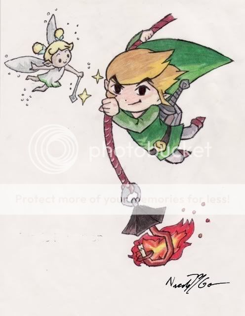
- Good job matching the original, very well done... but I cannot stand the Photoshop work. If it was just a white background or a simple diagonal line seperating two colours or something, it would look a lot more professional. I look forward to seeing more
- Report As Spam
- SilverRinehart66 - 01/14/2013
-
@KitsuneKage13
It's not traced, kiddo, but I guess I should glad it looks close enough to the original that you would think so. And yes, the colors are similar, because I used something called color sampling to get him as close as possible to the actual picture. What's wrong with that? What color should I have made him? Orange? Would that be more suitable? Thanks for the stupid comment, which I will now delete. - Report As Spam


