- Title: King Lear
- Artist: shibea
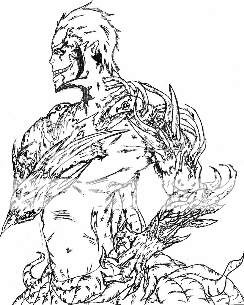
- Description: This is a scratch art project i did. Originally it was looking at the ground, but i accidentally changed that. It took forever, but it turned out amazingly better than i thought it would. I called it king lear because i think it looks like it's leering out over you and i like being a bad speller. Please comment on what i could have done to make it better. Thanks.
- Date: 06/23/2009
- Tags: king lear
- Report Post
Comments (4 Comments)
- Otterlove - 06/24/2009
- Its really good. Maybe having the back a little bit lower. Anyway its excellent!!!
- Report As Spam
- bunnyincharge - 06/24/2009
- good :]
- Report As Spam
- QC Soldier - 06/24/2009
- This is rly good I like da name 2
- Report As Spam
- crystalline_felina_amorus - 06/24/2009
- The top of his head blends in with the body but it's a really good picture.
- Report As Spam


